
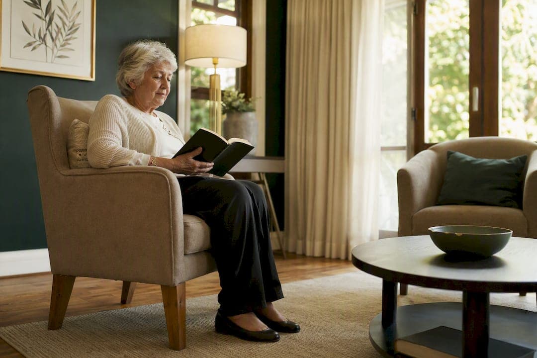
Dementia-friendly design supports independence, reduces confusion and lowers the risk of falls and accidents around the home. The three changes that matter most, in order, are improving lighting throughout the house, increasing tonal contrast between surfaces and objects, and clearing away trip hazards and confusing patterns from floors and pathways. Below, we've set out a full room-by-room checklist, the materials that genuinely help, and where to find further support.
TL;DR:
- Improving lighting and contrast is essential because shadows, glare, and similar LRVs can cause confusion and increase fall risks for people with dementia.
- Floor finishes should be matte and free of bold patterns to prevent visual cliffs that lead to hesitation and falls.
- Using high-contrast, brightly colored tableware can significantly increase food and liquid intake in dementia patients.
- Immediate safety risks like poor lighting, loose rugs, and clutter should be prioritized before adding contrast or signage features.
- Regular home audits are necessary as needs change over time, with initial focus on hazard removal and later adjustments for engagement and orientation.
Table of Contents
- What are the core principles of dementia-friendly design?
- A room-by-room checklist for a dementia-friendly home
- Which materials and finishes actually help?
- How can you make a garden dementia-friendly?
- Do you need professional help to assess your home?
- How does The Alderley Clubhouse put this into practice?
- Where can you find official guidance and checklists?
- What matters most, and what's overrated?
- Sources
What are the core principles of dementia-friendly design?
Good design for dementia rests on a handful of principles that, once you understand them, you'll start spotting everywhere, in every room of the house.
Lighting comes first because dementia affects visual processing as much as memory. Bright, even lighting throughout the home reduces shadows that can look like holes or obstacles. Avoid glare from bare bulbs or shiny surfaces, and fit sensor-activated lights in entrances, hallways, stairs and toilets so nobody's fumbling for a switch in the dark.
Contrast is where most homes fall short. Every surface has a Light Reflectance Value, or LRV, a simple measure of how much light it reflects. A white wall might sit near LRV 80, while a pale grey worktop sits closer to 30. When adjoining surfaces share a similar LRV, a person with dementia can struggle to see where a worktop ends and a wall begins, or where a toilet seat starts against a white bowl. Aim for a strong LRV difference between a door frame and the wall around it, and between key fittings and their backgrounds, following the NHS home-environment guidance on room-specific changes.
Signage and wayfinding work best when words are paired with clear, simple images, positioned slightly lower than standard eye level and used consistently throughout the home. A toilet door with both the word "Toilet" and a simple picture helps far more than either alone.
Flooring should be matt, plain and free of large pattern changes. Shiny floors can look wet; bold geometric patterns can look like steps or gaps. This is what occupational therapists call a visual cliff, and it's a leading cause of hesitation and falls in people with dementia.
Acoustics matter more than most families expect. Hard surfaces bounce sound, and hearing aids amplify that bounce, turning a busy kitchen into a wall of noise. Soft furnishings, rugs on solid (non-slip) underlay, and curtains all help absorb excess sound.
Furniture should be stable, at a comfortable seated height, and arranged so routes through the room stay clear and obvious. Low coffee tables and glass-topped furniture are common tripping and confusion points.
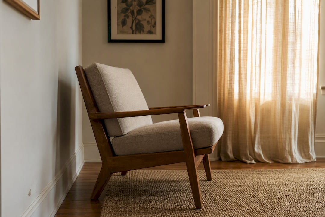
Pro Tip: Walk through each room at the height of a seated person, and take a photograph. Reflections, glare and pattern clashes are far easier to spot in a still image than in the room itself.
A room-by-room checklist for a dementia-friendly home
Work through each space in this order, starting where accidents are most likely and finishing with the areas that support day-to-day comfort.
- Entrance. Keep the path to the door clear and well lit, with a recognisable feature, such as a plant pot or a familiar colour, so the entrance is easy to identify from a distance. Make sure the door itself contrasts with the surrounding wall.
- Living room. Light the whole room evenly rather than relying on lamps that create pools of shadow, and reduce reflections from television screens and glass-fronted cabinets. Keep familiar photographs or ornaments visible for orientation, and arrange seating so everyone can see the door and each other.
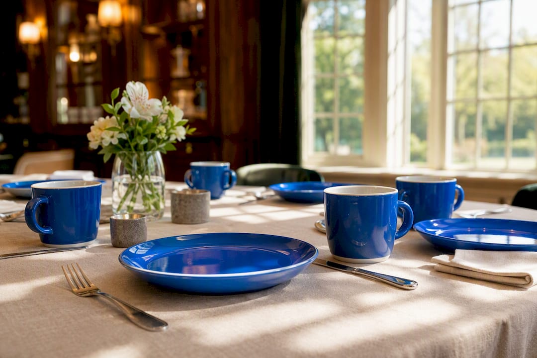
- Kitchen and dining area. Use open or glass-fronted storage so contents stay visible, and choose tableware that contrasts clearly with the table and the food on the plate. Fit appliance controls with large, simple markings, and use non-slip flooring near the sink and cooker.
- Bathroom. Install grab rails in a colour that stands out against the wall, fit a toilet seat that contrasts with the bowl and surrounding tiles, and lay slip-resistant flooring throughout. Simple lever taps are easier to operate than dial mixers.
- Bedroom. A clock showing the day and date, not just the time, helps enormously with orientation. Offer good blackout options for sleep, and keep the route from bed to bathroom completely clear of furniture and rugs.
- Circulation and communal areas. Maintain a continuous sightline wherever possible, so a person can see their destination rather than navigating blind corners. Avoid dead-end corridors, add lighting at every threshold, and fit handrails that contrast with the wall behind them.
This sequence mirrors the audit approach used in the Kirklees dementia design toolkit, which was developed with the University of Stirling's Dementia Services Development Centre and applies equally well to a family home, a care setting or a community venue.
Which materials and finishes actually help?
Product choice matters as much as layout. Flooring should carry a matt finish with only gradual tonal changes between adjoining areas. Sharp pattern breaks, even attractive ones, register as obstacles to someone with reduced depth perception, a risk flagged in hospital design research on dementia-friendly environments.
For paint and finishes, use tonal contrast deliberately rather than gloss or shine. A matt paint one or two shades darker than the surrounding wall makes a door frame or skirting board stand out without any glare.
Fittings should favour lever handles, familiar tap styles and door furniture that's easy to see and grip. Light switches with large, high-contrast plates are far easier to locate than flush white switches on a white wall.
Tableware deserves special attention. One PubMed-indexed study found that switching to high-contrast, brightly coloured tableware increased food intake by 24% and liquid intake by 84% among people with dementia, likely because food and drink become far easier to distinguish from the plate or cup itself. Manufacturers such as Ornamin have built entire ranges around this principle, favouring strong, warm colours like red that stand out clearly on a table.
Avoid highly reflective surfaces, busy or floral patterns, and mirrored panels, which can be genuinely disorientating rather than decorative for someone with dementia.
How can you make a garden dementia-friendly?
A garden that's safe and stimulating supports wellbeing without becoming a source of risk.
- Keep boundaries secure but legible, avoiding tall, prison-like fencing that removes any sense of the world beyond the garden.
- Lay flat, non-slip paving in a simple loop, so there's always a clear way back rather than a path that forces a decision.
- Ensure clear sightlines from inside the house, so a resting spot can be seen from the kitchen window.
- Provide sheltered seating and raised planting beds, which make gardening possible without kneeling or bending.
- Add sensory planting and features that attract birds or butterflies, and light entrances and paths well for dusk.
Do you need professional help to assess your home?
Most local councils offer a home needs assessment, often leading to equipment loans or minor adaptations such as grab rails and ramps at little or no cost.
For anything beyond the basics, an occupational therapist or dementia-design consultant can carry out a full environmental audit and recommend targeted changes.
- Prioritise immediate safety risks first: loose rugs, poor lighting, trailing cables.
- Then tackle orientation aids: signage, colour contrast, clocks.
- Address comfort and engagement last: seating, sensory features, personalisation.
Pro Tip: Start with whatever costs nothing, repositioning furniture, removing clutter, swapping a bath mat, before spending on larger adaptations.
How does The Alderley Clubhouse put this into practice?
The Alderley Clubhouse in Cheshire was purpose-designed around exactly these principles: even lighting, clear contrast, uncluttered circulation routes and secure, legible outdoor access. Our care team delivers Cognitive Stimulation Therapy, the only non-drug therapy NICE recommends for mild to moderate dementia, within a building built to support it. We'll share member feedback and case studies from the Cheshire facility as they become available.
Where can you find official guidance and checklists?
Start with the NHS guide to making your home dementia friendly for a practical, room-by-room home check. For technical specification in care or communal settings, HBN 08-02 sets out NHS England's design standards. The Kirklees toolkit offers a downloadable audit checklist, and the tableware study on PubMed underpins the dining recommendations above.
What matters most, and what's overrated?
Most guidance on this topic buries the most useful advice under decorating tips. Colour schemes and "dementia-friendly" wallpaper get disproportionate attention online, yet the evidence points somewhere plainer: lighting and contrast do more heavy lifting than almost anything else, and they're usually the cheapest fixes available.
Where conventional advice falls short is treating this as a one-off makeover rather than an ongoing audit. A home that suits someone in the early stages of dementia often needs revisiting eighteen months later, as needs shift. The Kirklees toolkit gets this right by framing it as an audit process, not a shopping list.
If you're prioritising, start with hazard removal (loose rugs, poor lighting, reflective floors) before spending a penny on contrast or signage. Falls cause more harm, more quickly, than confusion does. Everything else, the clocks, the tableware, the garden loop, builds genuine quality of life once the basics are secure.
— Scott @ The Clubhouse
Sources
- PubMed: study on contrast-enhanced tableware and intake
- NHS — How to make your home dementia friendly
- NHS England — HBN 08-02 dementia-friendly health and social care environments (PDF)
- Kirklees dementia design toolkit (DSDC collaboration)